Error 3: Key Information Is Hidden Or Inaccessible
Visitors to your website are looking for key information about your practice that is going to influence their decision making. They want this information quickly and easily available without having to hunt and search through endless pages and large quantities of reading trying to find it.
Prior to making the decision to contacting your office, prospective new patients will be looking for specific things. Even a well laid out, nicely designed and attractive website can be rendered ineffective if visitors are led to, or what is highlighted, is not the right information.
If it is difficult to find the information they’re looking for, takes too much effort, or it simply isn’t available, prospective new patients will look elsewhere!
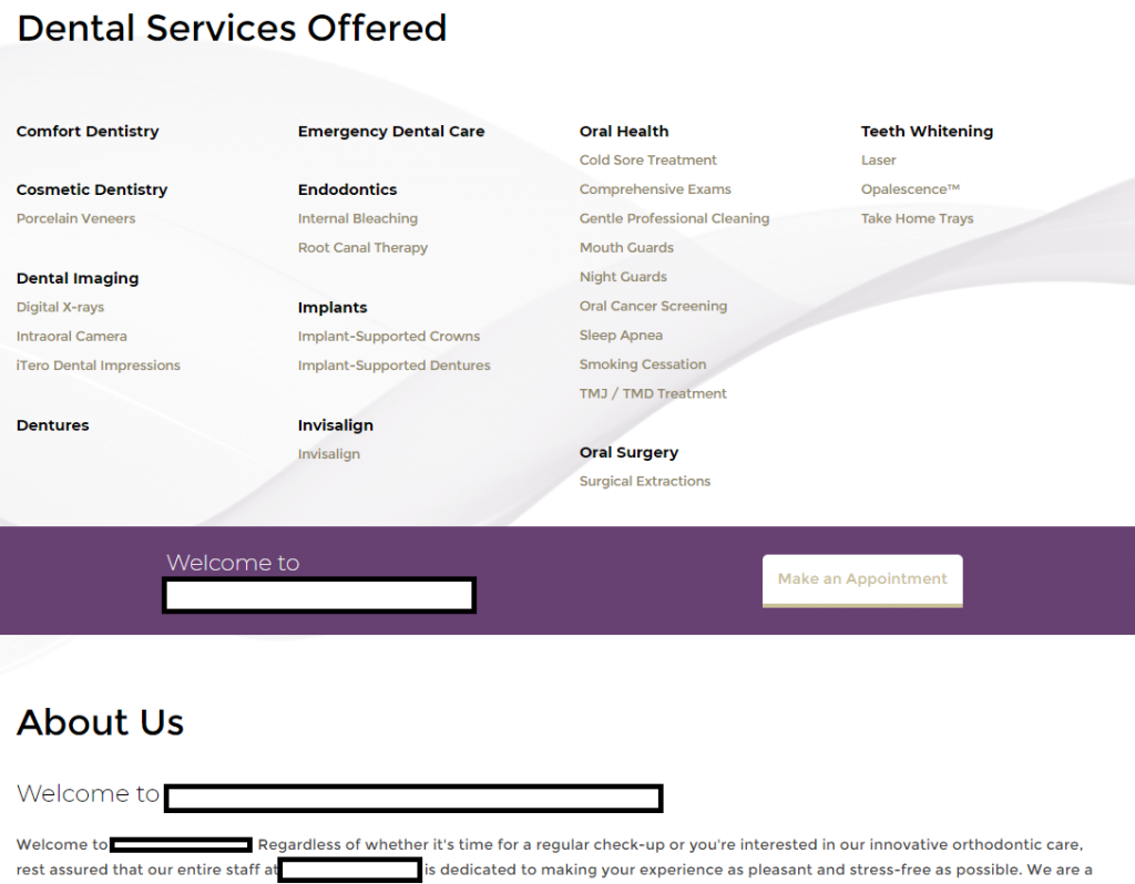
Like this example on the right. What is presented is a long list of services offered, a small bar welcoming them to the office, and then it dives right back into more small text! (And below that is 1-2 pages of scrolling “about us” information).
That’s not what a prospective new patient wants to see! Where’s the new patient information? Who is the doctor? Where are your reviews? Are there any specials for new patients? And once again – is that correct message properly highlighted and visible?
There can also be really silly issues. Even with current patients visiting your site! The majority of your current patients who visit your website are doing so for one simple reason: They need your phone number! They’re looking for contact info to call you regarding an appointment, whether to schedule, re-schedule, etc.
This of course applies to new patients as well, if they’ve decided they want to schedule an appointment, is your office’s contact information easy and obvious? Or do they have to dig through pages or walls of text to find it?
So often it is simply too difficult to quickly find contact information. Anything that causes unnecessary difficulty or effort can cost you new patients!
The Platinum Difference
Knowing what patients are interested in, and knowing what drives their decision making, allows us to properly highlight and lead website visitors to the key information.
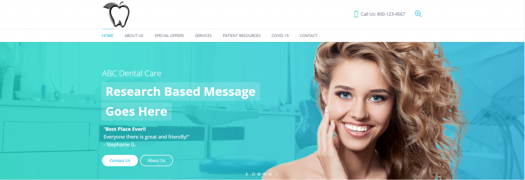
When they first pop up on your website, within seconds they should be hooked, with that research based message (what 76% of patients want!) highly visible and at the forefront of your site.
After that, other important factors must be clearly visible, easily accessible and not buried within pages and pages of text and scattered content.
Our websites are designed so prospective new patients easily and quickly see what they need to see to choose your practice.