Many dental websites are not designed to follow the “eye trail”, making them difficult to read and confusing. Many include fonts (typestyles) and color combinations that are jarring or dull or crowded. This frequently results in visitors bouncing and looking elsewhere.
What looks pretty or attractive to one person, may look ugly and unappealing to another.
So what’s the answer? Using well researched design and layout “rules” that improve website effectiveness across the board.
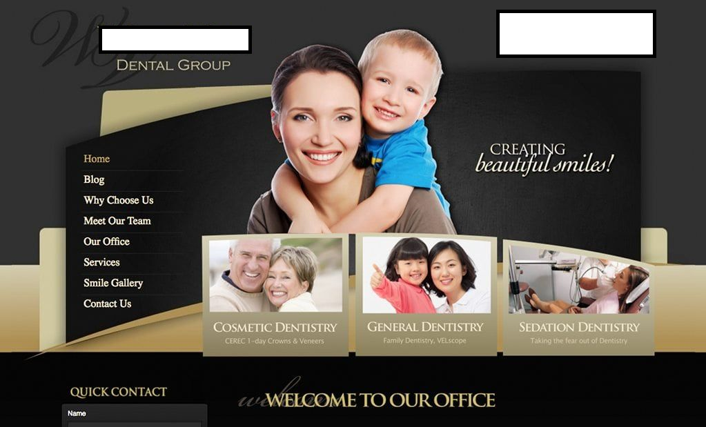
In the example to the right, it is very very dark. There is no natural focus or anywhere your eye is immediately drawn, except maybe the logo or the stock photo. How does that help a prospective new patient? People are not drawn to dark colors and dark themes.
Let’s look at a few more examples… (All examples are of current – live websites)
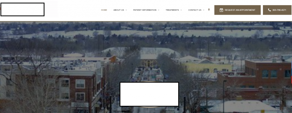
How about the example to the left?
You may not even know it’s a dentist office without reading the text on the logo (we’ve blocked for privacy). There’s no immediate or obvious direction for website visitors to see what the website is even about!
The picture in the background is of a snowy town… Again, is this a dentist?
There is no button, no message, no prompt, nothing that tells visitors what to do, where to look, or leads them in the right direction. You’d simply have to scroll or click around to figure it out. Which many prospective patients simply will not do! They’ll head somewhere else.
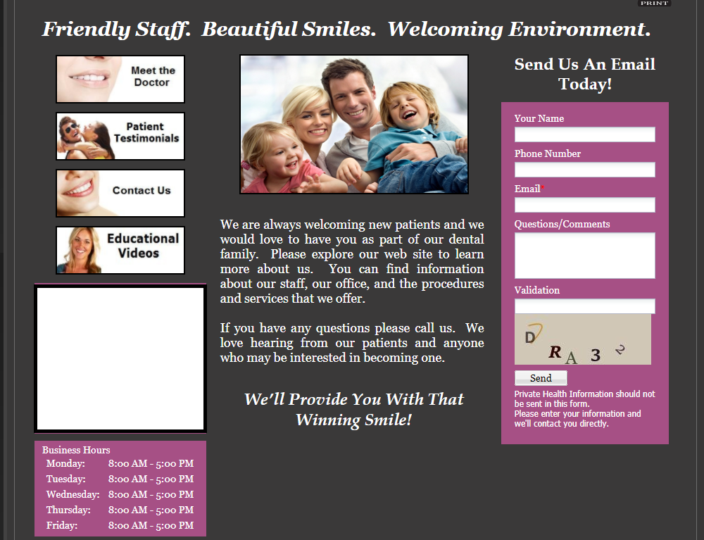
Off the bat, we can of course say that the design itself looks old, outdated and dark.
But the slightly dated nature of the design is really not the issue! You don’t have to have a gorgeous, stunning website for it to be effective.
The bigger problem is that the website is “scattered” in its design. There’s no natural “eye trail”, no natural direction on where to look and how to read the page. It is just a bunch of different things thrown on to fit.
A prospective new patient might look at this, not have it be clear what they should do next, should they send an e-mail? (Why would they do that?) Should they call? Is there anything for new patients? Unanswered questions lead to confusions – not decisive action.
A website visitor is very likely to reach this page, and bounce off the website to look elsewhere.
The Platinum Difference
All our websites are designed to be bright, warm, friendly and inviting. Going to the dentist isn’t anyone’s favorite thing to do. What makes it worse is if it looks too cold, corporate or impersonal. Having a warm, friendly and inviting website will help put prospective patients at ease and help to calm any fears or anxiety regarding going to the dentist.
In addition to that, the website design, layout, colors and fonts must highlight the right things. It must lead prospective new patients towards the information they want to see and are interested in seeing. With the information from our survey, we are able to determined precisely what is interesting to website visitors, and design websites with this in mind.